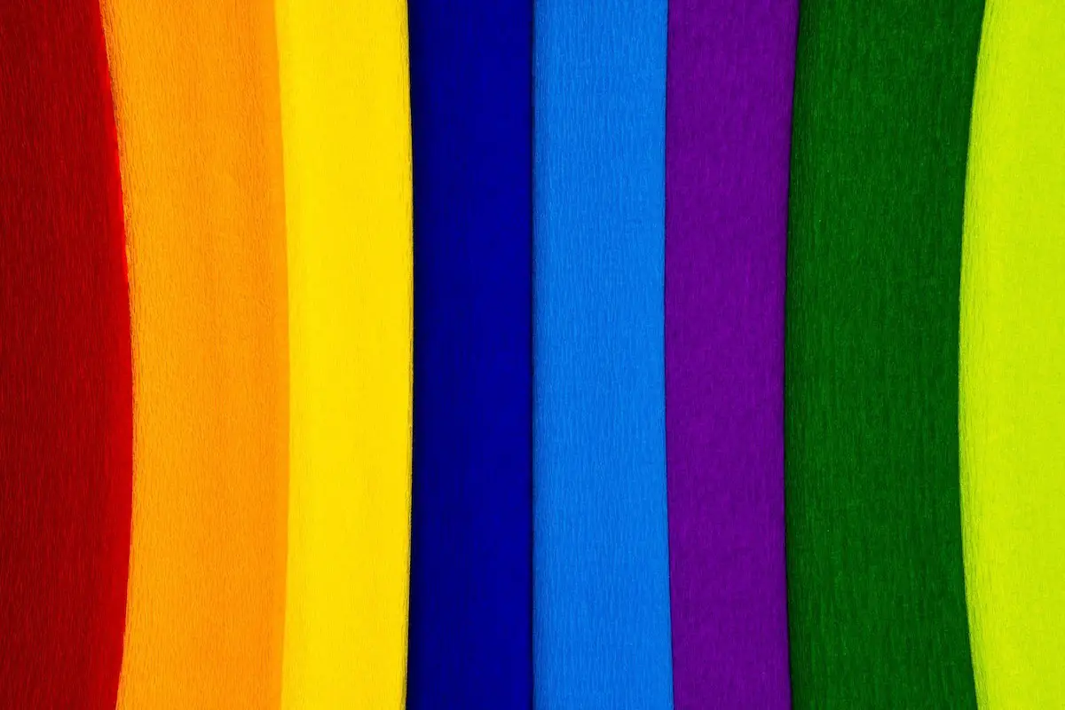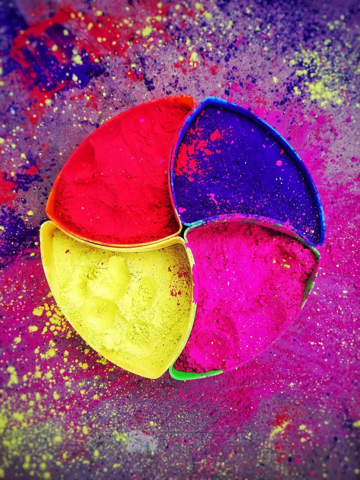
The selection of colour is an important challenge in interior decoration and any design project.
Design requires certain criteria when selecting the colour scheme. To manage this, it is important to understand the basic principles of the colour.
Basic principles of the colour for any design projects
All colour is created by the reflection and absorption of rays from the natural and/or artificial light- though they are an infinitesimal fraction of the sun’s rays in strength. (1) – source.
For instance, green absorbs the red rays and reflects only blue and yellow rays or purple absorbs the yellow and reflects red and blue.
The natural materials such as wood, textiles, marble important source in deciding the colour scheme. It has pointed out that, “the problem is to select colours to develop a harmony that it will create a pleasing in appearance and produce a desired psychological and emotional reaction upon those who observe it.” (1)
While at the same time it was not advised to use colour charts by many experts, (1) so what is the best way to choose your colour scheme as efficient for your tiny space, but also personalized for your design taste and not similar stereotype colours that everyone suggests.
Before to go with further, it is important to understand the nature of the colour.
Characteristics of the colour
“All pigment have four dominant characteristics, as following;
1-Hue;
It is the colour itself like red, blue, orange.
2-Chromatic Value;
It is the intensity or brilliance of a colour. Adding grey, black or white makes the colour look dull. Relative proximity to their strongest brilliance is called ‘degree of neutrality’
3-Tonal Value;
It is the lightness- that is described as ’tints’- or darkness- that is named as ’shades’- of the colour.
4-Finish;
It is the degree of lustre- named sheen or glaze-, gloss or light reflection. The end finishes then either mat or gloss.” (1)

1-Hue
COLOUR CHART
Primary Colours
- Blue
- Red
- Yellow
Secondary Colours
- Violet (Purple)= (Blue+Red)
- Orange= (Red+Yellow)
- Green= (Yellow+Blue)
Tertiary Colours
- Plum (Blue-violet)
- Mulberry (Red violet)
- Russet (Red orange)
- Flame (Yellow-orange)
- Citron (Yellow-green)
- Slate (Blue-green)
Quaternary Colours
- Blue plum
- Violet plum
- Yellow citron
- Greenish citron
2-Chromatic Value
Neutralization of Colours
The blue, red and yellow are the prime colours in the chart.
Combination of any two of the prime colours will create the third secondary colour, as such;
- (Blue+Yellow)= Green
- (Red+Blue)= Violet/Purple
- (Red+Yellow)= `Orange
However, if the third missing complimentary colour added to these two of the mixture, then the combination is ’neutralized’ and approach to grey. (1)
The only issue is that the neutral tone will be darker and needs some white when it is compared to the neutralization by adding black or grey. However, it maintains the chromatic strength better.
The idea of neutralization is that;“as colours increasingly neutralize they develop greater harmony with each other because they gradually approach the same colour.”
“Strong chromatic values in colour schemes invariably become offensive and tiresome.’

3- What are the factors that affect the colour tone
– that the way we observe the colour
- Impact of the distance
- Size of the area
- Effect of the adjoining colours
- Improvement of the natural light
- Quality of the artificial light
- Touch of the texture
are the basic principles colour.
4-Finish
The basic principles of colour harmony are following;
- “Never select a collar without having a reason
- Consider first the general character and purpose of the room, and when and how often it is to be used
- Consider the size, orientation, the texture of surfaces, and amount and quality of natural and artificial light
- Select the more neutral tones for the large background areas of the room, keeping the darkest for the floor and lightest for the ceiling. Area and distribution are more important than hue in colour harmony.
- Select a secondary key colour for upholstery and curtains, which will be prominent regardless of pattern
- Select colour accents for the small objects in colours complementary to the background
- Study the difference between the plain surfaces and figured surfaces. Use both, if necessary, and contrast them with each other. Contrast surfaces may be obtained by texture as well as b colour and pattern.
- See the scale and type of patterns of figured surfaces are in harmony with the furnishing.
- Select textiles and wallpapers before choosing the paint colours.
- Try large samples of all colours in place under final lighting conditions before making a final decision.
- Simple colour schemes in which few colours are used are more effective than complicated schemes of many colours.
- Limit yourself to the use of old two or three colours for walls, curtains &/or large upholstery and floors. The same colours (Particularly the accents) should be recalled in various small objects and/or surfaces. (p.706)”
Physiological Impact of the Colours
– that a very conservative way of looking
The physiological impact is a kind of language of the colour that symbolizes the physical colours.
- White= Purity, peace, faith, joy, cleanliness
- Red= Passion, anger, warmth, gaiety, martyrdom, revolution
- Blue=Restfulness, coolness, sky, constancy, mourning
- Black= Darkness, despair, sorrow, mourning
- Green= Spring, hope, restfulness, fruitfulness, coolness
- Yellow= Warmth, cheerfulness, fruitfulness, jealousy
- Gray= Humility, penance
- Purple= Justice, royalty, depression, suffering, church color
- Gold= Royalty, luxury, power
- Pale blue= Male child
- Pink= Female child
Source:
(1) Elements of Interior Decoration